About Me

portrait3.jpgI am a computer architecture Ph.D. student at The University of Texas at Austin. This is my blog about computer architecture. I also have a regular academic website with my publications and other academic info.

Posted in Uncategorized | Leave a comment

Making EZProxy easier

Graduate students like me read lots of research papers. Not all research papers are available for free download online—yet—so we have to access them through our university’s EZProxy gateway. I made a simple bookmark that makes reading papers with EZProxy a snap and I am sharing it with you. For my university (UT-Austin), the address for the bookmark looks like this:

javascript:location.href='http://ezproxy.lib.utexas.edu/login?url='+location.href

To generate an address for another university’s EZProxy gateway, simply replace the URL in single quotes with the appropriate URL for your university; if in doubt, check this helpful list.

Once you have the right address for your university, simply add it to your bookmarks. Now, whenever your literature search leads you to an academic paywall page (usually an IEEE or ACM page for me), just click on this bookmark and your browser will automatically redirect to the same page through the EZProxy gateway (possibly asking you to supply your university credentials). In one click, you get to read the PDF!

By the way, this kind of Javascript-enabled bookmark (called a bookmarklet) has been around for a long time, but of the students I know none make use of it; hence this post.

Final note: there’s also a Chrome extension that accomplishes the same task (in fact, its author maintains the list of URLs linked above), but I prefer not to clutter my browser with extensions if a simple bookmark will do.

Posted in Papers | Leave a comment

Memory-centric microarchitecture visualization

Visualization is a key part of microarchitectural analysis. Visualization is necessary because even the simplest in-order processor is incredibly complex; its performance may be affected by cache misses, branch mispredictions, pipeline stalls, DRAM contention, inaccurate prefetching, and so on. In any given cycle, there could be a hundred things going on in the processor that have impact on performance. The most efficient way to convey such complexity to the brain is visualization.

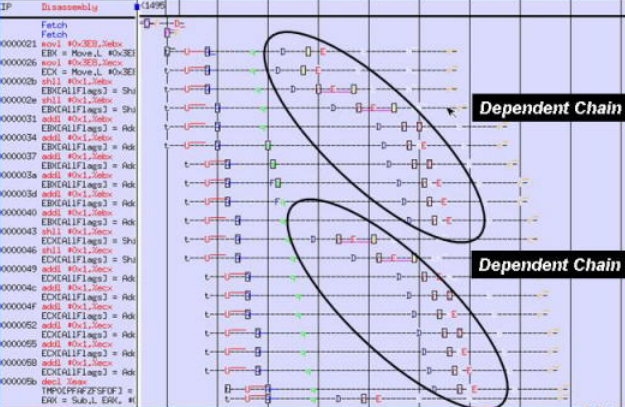
Most microarchitecture visualization tools are pipeline-centric. For example, here’s a annotated screenshot of an industrial pipeline visualization tool (this picture comes from an old Intel presentation):

intel_pipetrace

In this style of visualization, instructions are listed in program order from top to bottom, and processor cycles are shown left to right. Each single letter symbol represents some microarchitectural event. In our research group simulator, we have a similar visualization tool (borrowed from gem5):

pipeviewThese pipeline-centric visualization tools are very useful for analyzing single core performance; they show effects of instruction dependencies, cache misses, and wrong path execution.

Unfortunately, these tools are not as useful for analyzing multi-core performance. When multiple programs or threads are running on a multi-core processor, they contend for shared resources, such as last level cache capacity and DRAM bandwidth. Often, this contention is a major factor in performance. However, pipeline-centric visualization tools cannot adequately represent shared resource contention and therefore fail to show the full picture.

In my research, I’ve been using a different, memory-centric kind of microarchitecture visualization to analyze shared resource contention. Here is an annotated screenshot (for simplicity, I only show two cores and four DRAM banks):

memview

This style of visualization is much more useful for analyzing shared resource contention than the traditional pipeline-centric style. I am currently using this visualization style to look at DRAM contention only; that’s why there’s no shared cache contention shown. However, this visualization style can be easily extended to show shared cache contention as well.

Posted in Simulation, Visualization | Leave a comment

Why TAGE is the best

The TAGE branch predictor by André Seznec and Pierre Michaud is the best branch predictor today, winning the last two branch predictor competitions (CBP2 and CBP3). It was introduced in a 2006 paper:

A case for (partially) tagged Geometric History Length Branch Prediction
André Seznec, Pierre Michaud
Journal of Instruction Level Parallelism (JILP), 2006.

While this and other papers on TAGE describe the branch predictor in great detail, they do not (in my opinion) explain the insights behind TAGE, that is, why TAGE works so well. In this post, I give my view of what makes TAGE so great.

I’ll first define what I call a “branch scenario,” a concept important to understanding any branch predictor.

The key premise of branch prediction is that branch behavior repeats, which means branch behavior can be learned and predicted. Specifically, we usually assume that the outcome of a branch is a function of two inputs:

  1. the address of the branch, which distinguishes it from the other branches, and
  2. branch history, a sequence of prior branch outcomes.

I call this tuple {branch address, branch history} a “branch scenario.” The branch predictor “learns” branch behavior by recording the branch outcomes observed in each encountered branch scenario. The branch predictor predicts the branch outcome for a particular branch scenario by looking up what happened the last few times the same branch scenario occurred.

A key question in branch prediction is how long should the branch history be? On the one hand, longer histories enable accurate predictions for some harder-to-predict branches. On the other hand, with a longer history, the predictor must track more branch scenarios and thus spend more time warming up, reducing accuracy for easier-to-predict branches.

This fundamental branch prediction tradeoff was the inspiration behind hybrid branch predictors which use multiple branch histories (see McFarling’s predictor for an early example). Roughly speaking, for each branch, hybrid predictors track prediction accuracy for that branch given different history lengths. The history length that results in highest accuracy is the one used to generate the predictions for that branch.

TAGE is one such hybrid branch predictor; however, three major improvements set it apart:

  1. Entry tagging

    Most prior branch predictors do not tag predictor entries. They simply use branch history and address (that is, the branch scenario) to index into some predictor entry and assume that the entry represents the same branch scenario. With longer branch histories, multiple branch scenarios are likely to alias to the same entry. In contrast, TAGE partially tags its entries, so that TAGE can determine with high certainty which branch scenario an entry corresponds to.

    This ability is important because in hybrid branch predictors the currently predicted branch scenario indexes into multiple predictor entries (one for each tracked branch history length). Untagged predictors do not know which of these predictor entries truly correspond to previous instances of the current branch scenario and which are aliased to other branch scenarios. Therefore, untagged predictors may predict the branch based on a previously observed outcome of a very different branch scenario! TAGE, on the other hand, does not make this mistake because TAGE knows which entries correspond to the current branch scenario and simply chooses the longest history entry from those.

  2. Entry selection

    TAGE selects which predictor entry (of those matching the current branch scenario) to use better than prior hybrid branch predictors do. Prior branch predictors make this choice simply based on the branch address. Some branches are detected to require long history, whereas others are predicted accurately with short history. In contrast, TAGE makes this choice on an even finer granularity. In fact, TAGE may use entries with different history lengths for different branch scenarios of the same branch. This happens due to the way TAGE keeps track of entry “usefulness” (see paper for details).

    The finer granularity of entry selection allows TAGE to better trade off history length versus warmup time. Specifically, unlike prior predictors, TAGE does not suffer high warmup time on those branches that have only a few branch scenarios that require long history to be predicted accurately.

  3. Longer maximum history

    Entry tagging and better entry selection enable TAGE to use longer branch histories (into the hundreds of branch outcomes). Prior hybrid branch predictors cannot not use longer histories due to the risk of aliasing and high warmup time. In TAGE, entry tagging takes care of aliasing whereas better entry selection reduces the risk of unnecessarily high warmup time. Therefore, TAGE is able to get away with tracking very long branch histories, increasing accuracy for those branch scenarios in which long histories are important.

In my opinion, these three improvements are the reason why TAGE outperforms all other branch predictors.

Posted in Branch Prediction, Papers | 3 Comments

Paper: A Model for Hierarchical Memory

Asymptotic complexity of algorithms (the “big-O” notation) is a staple of computer science and engineering. We usually focus on asymptotic worst-case time complexity. For example, we know that quicksort can take up to n2 steps to sort a sequence of n elements (within a constant factor), so we denote the time complexity of quicksort as O(n2). This expression represents the worst-case algorithm execution time as a function of input size in an architecture-independent way. Or does it?

Not quite. As architects, we know very well how data locality affects execution time. Any computation operation needs data. Depending on where the data comes from (registers, cache, DRAM, or disk), the latency of accessing the data varies and is often much larger than the latency of actual computation. More importantly, this data access latency is not just a constant factor.

Asymptotically, as n, the size of the input set, approaches infinity, the space needed to store the input set also approaches infinity. Assuming storage density to be finite, that is a constant factor, the input set takes up O(n) space. If the n input set elements are stored in three dimensions, then the distance of an input set element to the computational unit is O(∛n). Since the speed of information transfer is finite, the latency of accessing any input set element is also O(∛n).

Therefore, for an algorithm that does not exhibit data locality (that is, each computation step may access any element of the input set), the latency of getting the data for each computation step grows asymptotically as O(∛n). On the another hand, if an algorithm does exhibit data locality, its data access latency will grow slower than O(∛n).

In 1987, Alok Aggarwal et al. extended traditional time complexity to consider this asymptotic impact of data access latency. Here’s the citation:
A Model for Hierarchical Memory
Alok Aggarwal, Bowen Alpern, Ashok K. Chandra, and Marc Snir
In Proc. 19th Annual ACM Symp. on Theory of Computing (STOC ’87), 1987.

After establishing the general ideas, the paper looks specifically at how data locality affects asymptotic time complexity of matrix multiplication, fast Fourier transform, and sorting. For some reason, the authors consider data access latency to grow as O(log n) instead of O(∛n); a lot of the paper, however, is independent of this assumption.

Posted in Papers | Leave a comment

Frequency scaling for simulator debugging

While working on a recent paper, I stumbled on an easy way to find errors in a computer architecture simulator. I simulated a processor at various frequencies and plotted the resulting performance. I expected to see a nice “smooth” set of points, perhaps something like this:

Expected effect of frequency scaling

Aside: in my paper, I explain why looking at execution time vs. cycle time is easier than looking at performance vs. frequency.

Instead, I saw a big jump in performance at a certain frequency point. The plot I got looked more like this:

Simulated effect of frequency scaling

Naturally, I investigated. It turns out that this particular workload (lbm) generates a lot of writeback memory requests. At high frequencies, these requests saturate the capacity of the buffers holding them. So sometimes a writeback is generated without an available buffer to hold it. The person who wrote the writeback code (who shall remain unnamed) assumed that this scenario would not occur often and chose to simply drop the writeback. Well, this scenario does occur often when running lbm at high frequencies, causing many dropped writeback memory requests. In turn, the drop in memory requests reduces off-chip memory contention, causing an unexpected performance improvement—the big jump in the plot.

Of course, I fixed this simulation inaccuracy, and a few others. I also learned a new way to detect simulator errors.

Posted in Simulation | Leave a comment